
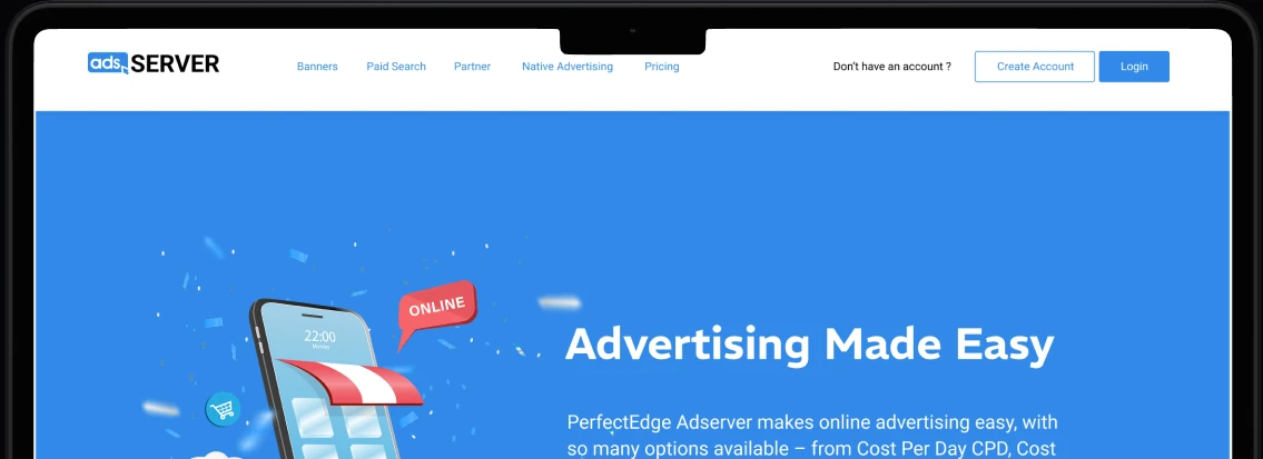
Project Background
At the time in 2019, placing an ad on many websites still meant one thing. Find the website owner, send messages back and forth, negotiate pricing, wait for replies, and hope the “metrics” you get later are not vibes and motivation.
So the idea behind AdServer was simple: let advertisers run ads without needing to chase anyone.
Users could:
- Sign up and manage campaigns themselves
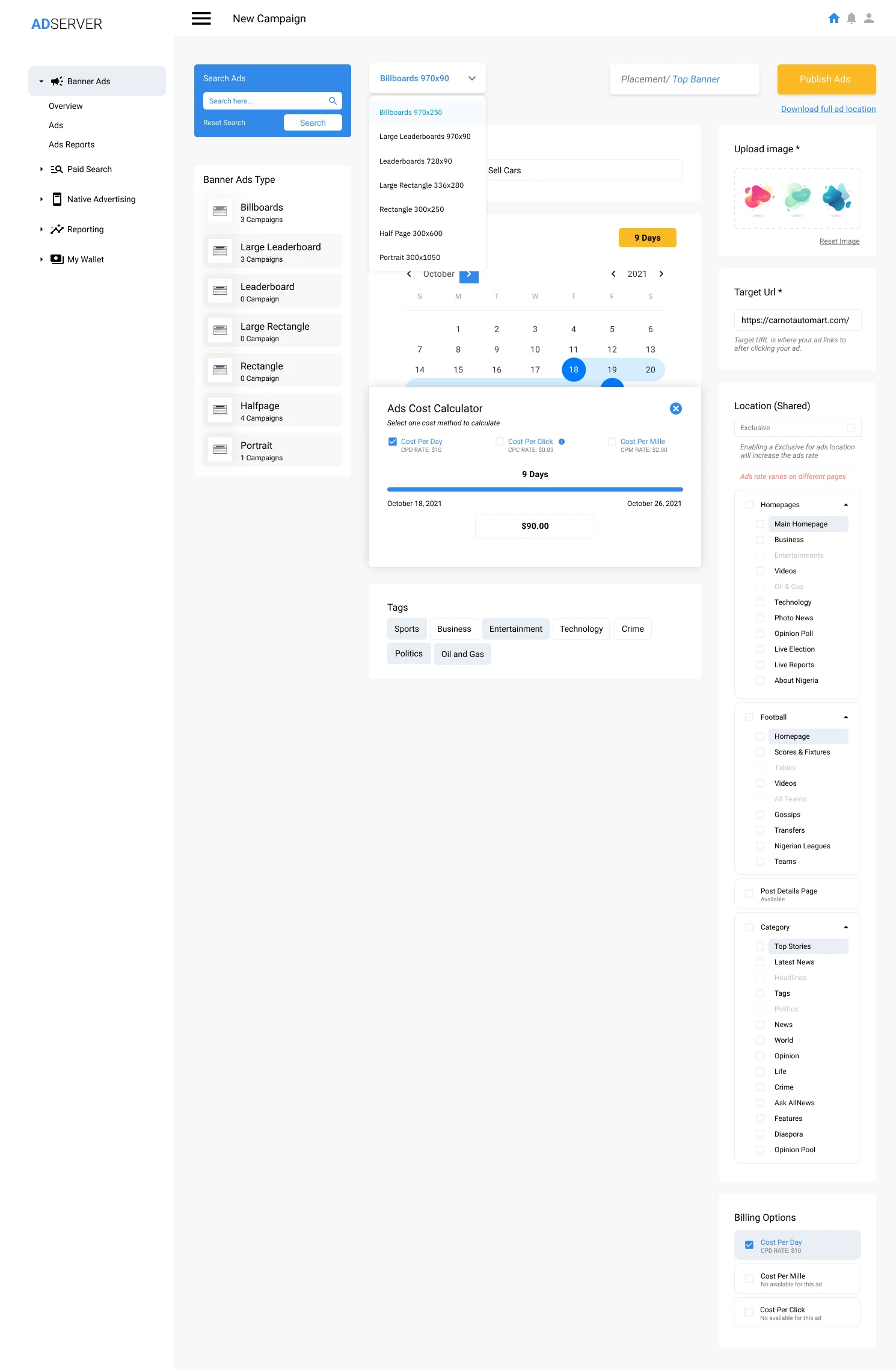
- See ad slots and prices upfront
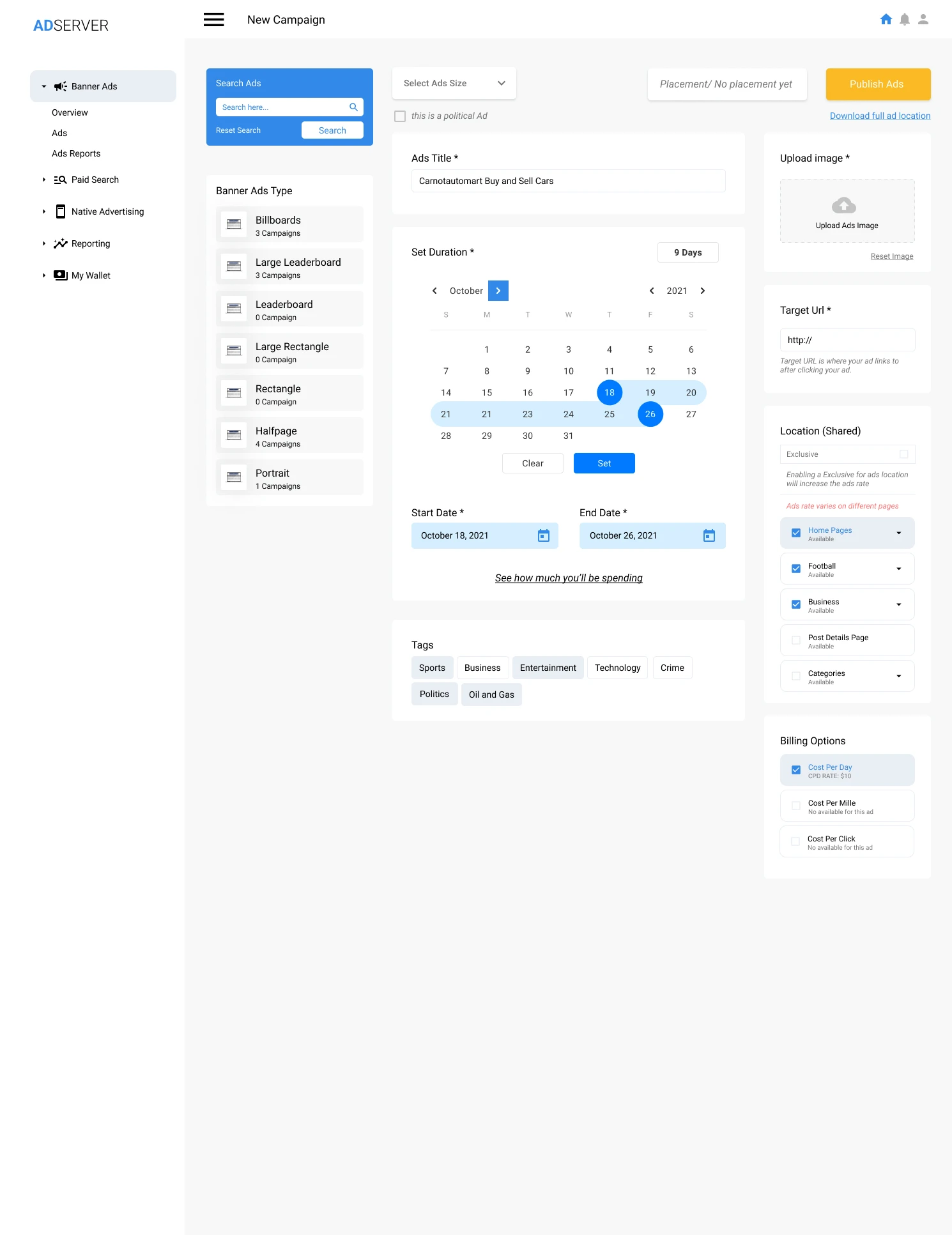
- Choose duration and upload creatives
- Fund a wallet and pay instantly
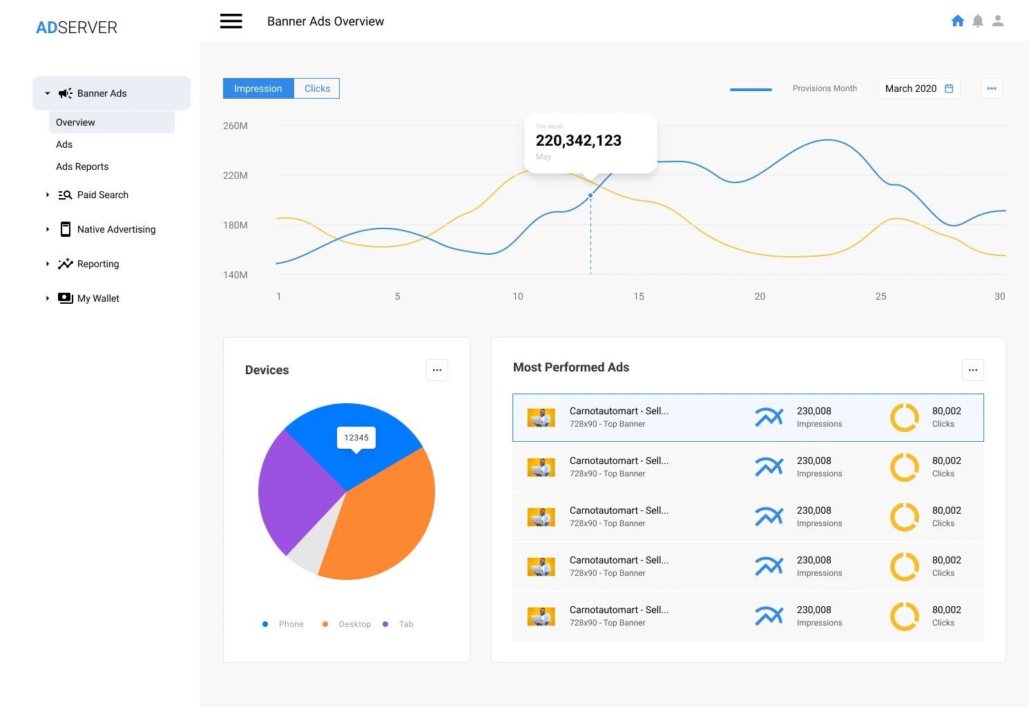
- Track real performance metrics inside a dashboard
The challenge
The Problem
We were solving two problems at once:
Access problem
Advertisers didn’t know how to reach a publisher fast, or didn’t want the stress of negotiating.
Trust problem
Advertisers wanted real, transparent metrics, not “Madam, your ad is doing well oo.”
Understanding the ecosystem
Discovery & Research
This project taught me a hard UX lesson. Sometimes the loudest “user research” is your own confidence. And that one can mislead you.
This was one of those projects where the early thinking was basically: “If I want this, users will want it too.” It sounded logical, but it needed validation. So I did a lightweight discovery approach because time was tight.
Learn the ecosystem first
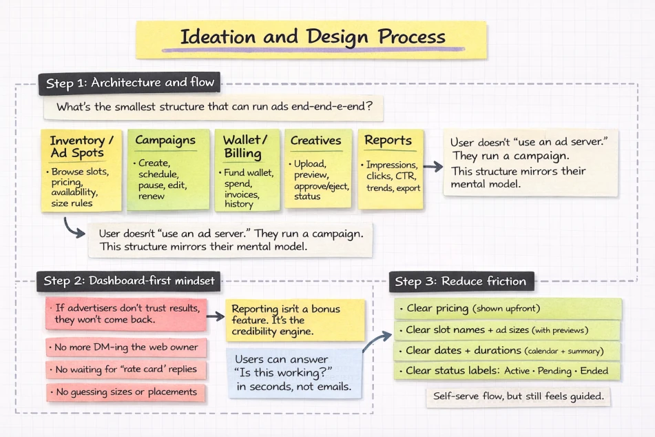
Before drawing screens, I studied platforms like Google Ad Manager and similar third-party tools to understand common ad concepts such as inventory, placements, impressions, CTR, and scheduling; what advertisers expect to control; and what publishers need to protect, including pricing, rules, and approvals.
Define the core jobs-to-be-done
I boiled the product down to the advertiser’s real job: I want to run an ad fast. I want to know what I’m paying for. I want proof it’s working. That’s why the UI leans heavily into self-serve steps and visibility around pricing, durations, and metrics.
Key UX insight
If the user is confused, the product is too proud.
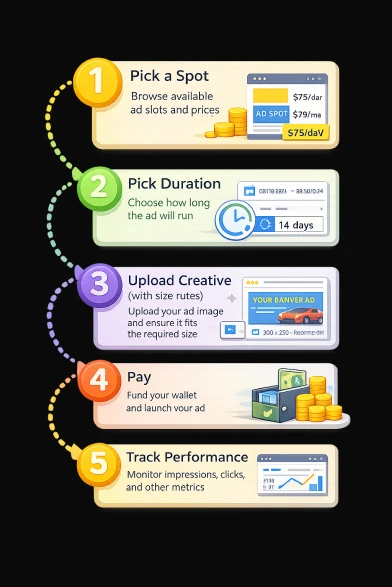
So I treated the experience like a guided checkout, not a “complex ad machine.” Instead of dumping users into a tool and saying “good luck,” the design guides them through a new flow.
The flow became: Pick a spot → Pick duration → Upload creative with size rules → Pay → Track performance. That general structure shows up in the User Dashboard and metrics sections of the mockups.
From insight to experience
Solution Insight
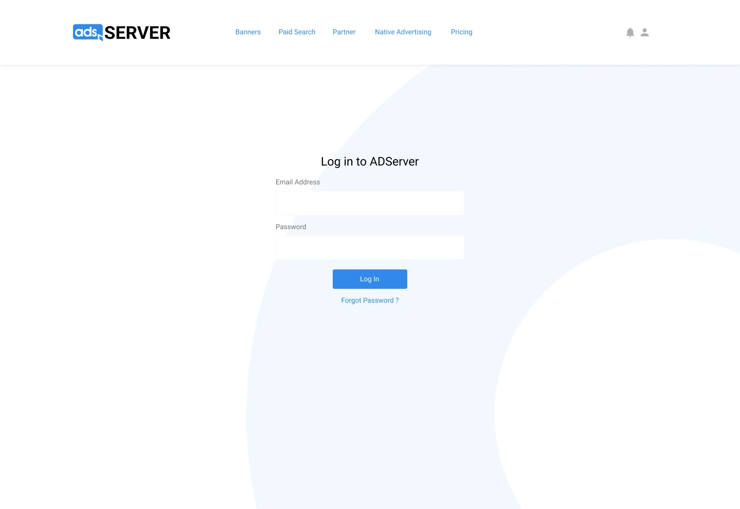
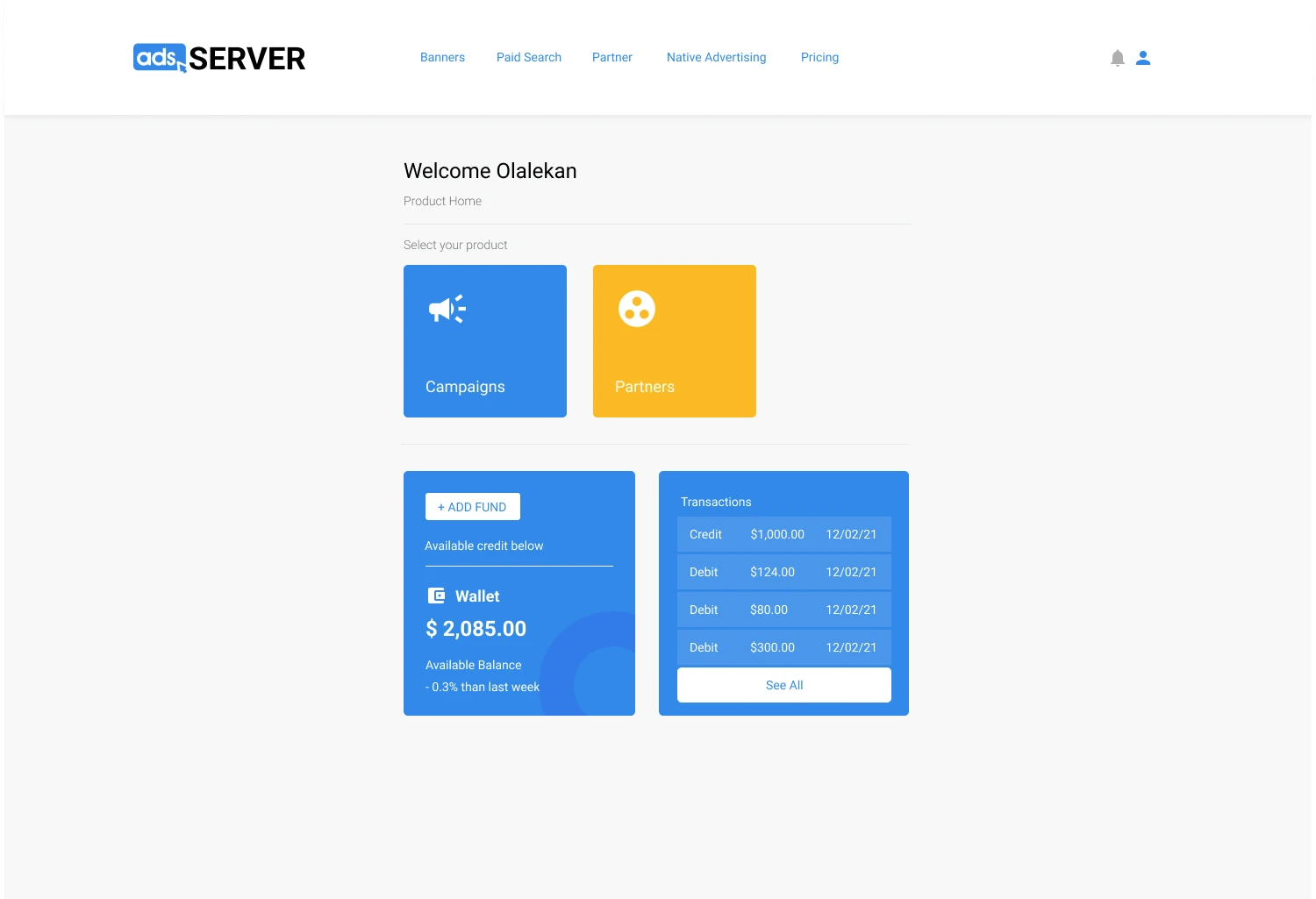
Guided dashboard after sign-in
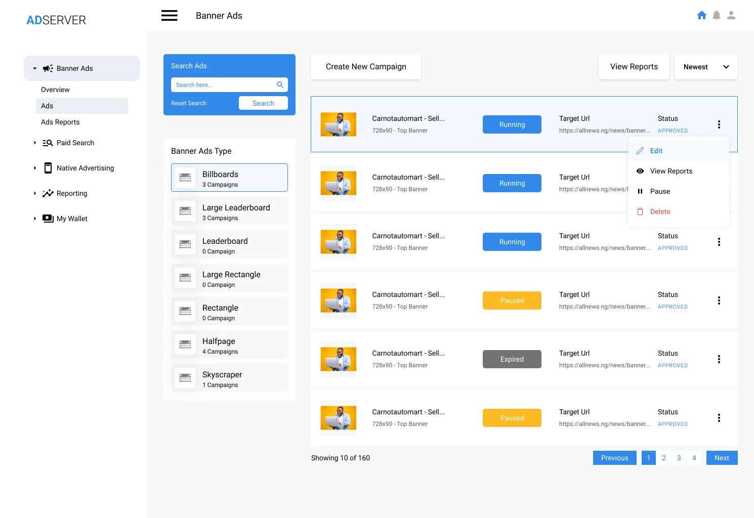
A full self-serve dashboard where users can fund their wallet, configure campaign details, and track status over time without chasing anyone.
Public landing page before sign-in
Assumptions are expensive, so I now push for early feedback, even when it’s scrappy.
Public experience
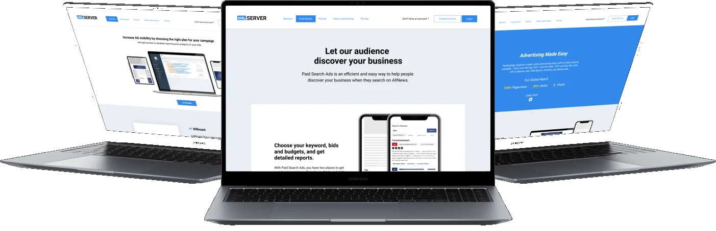
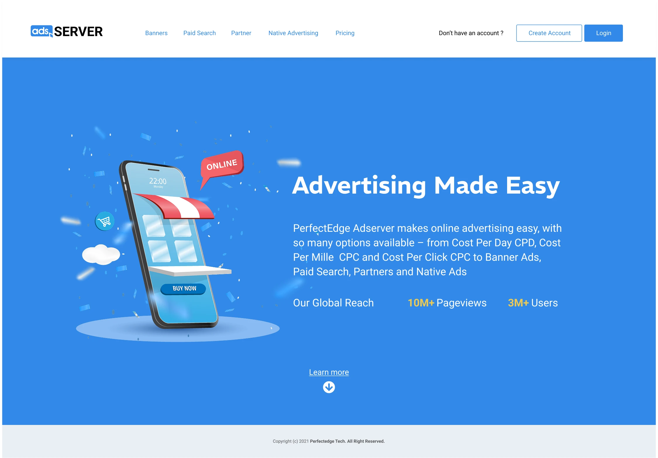
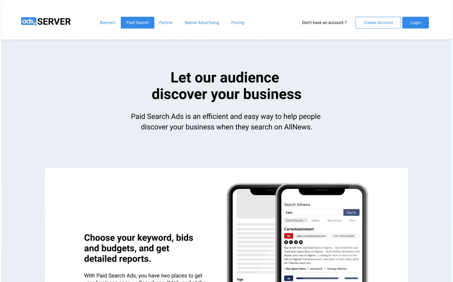
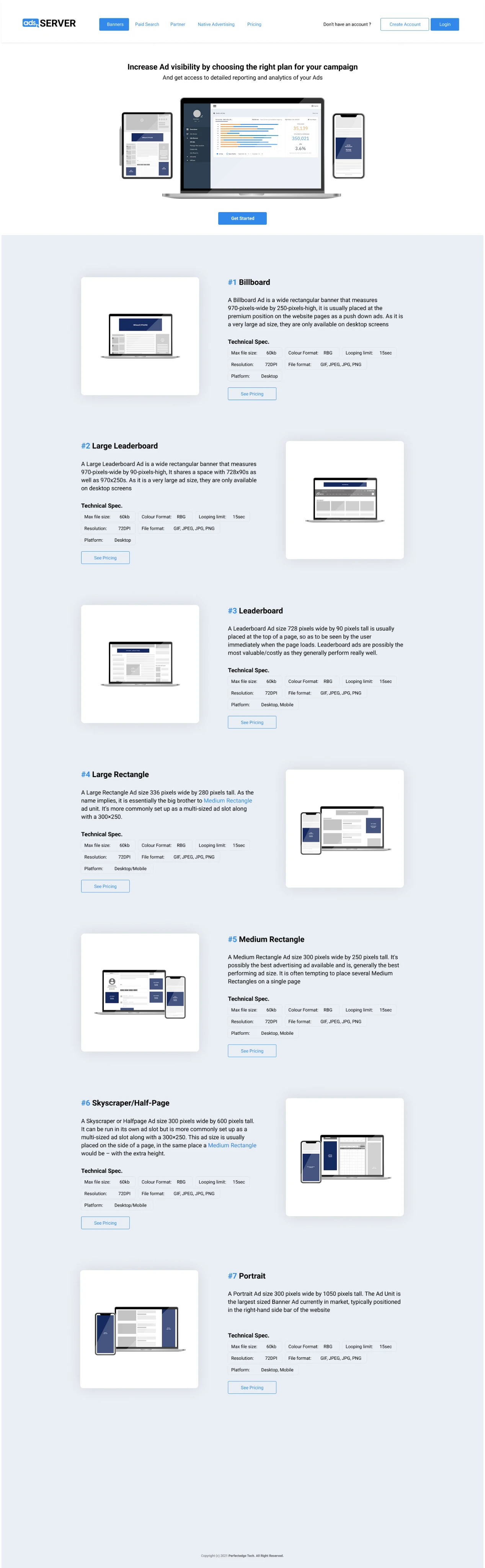
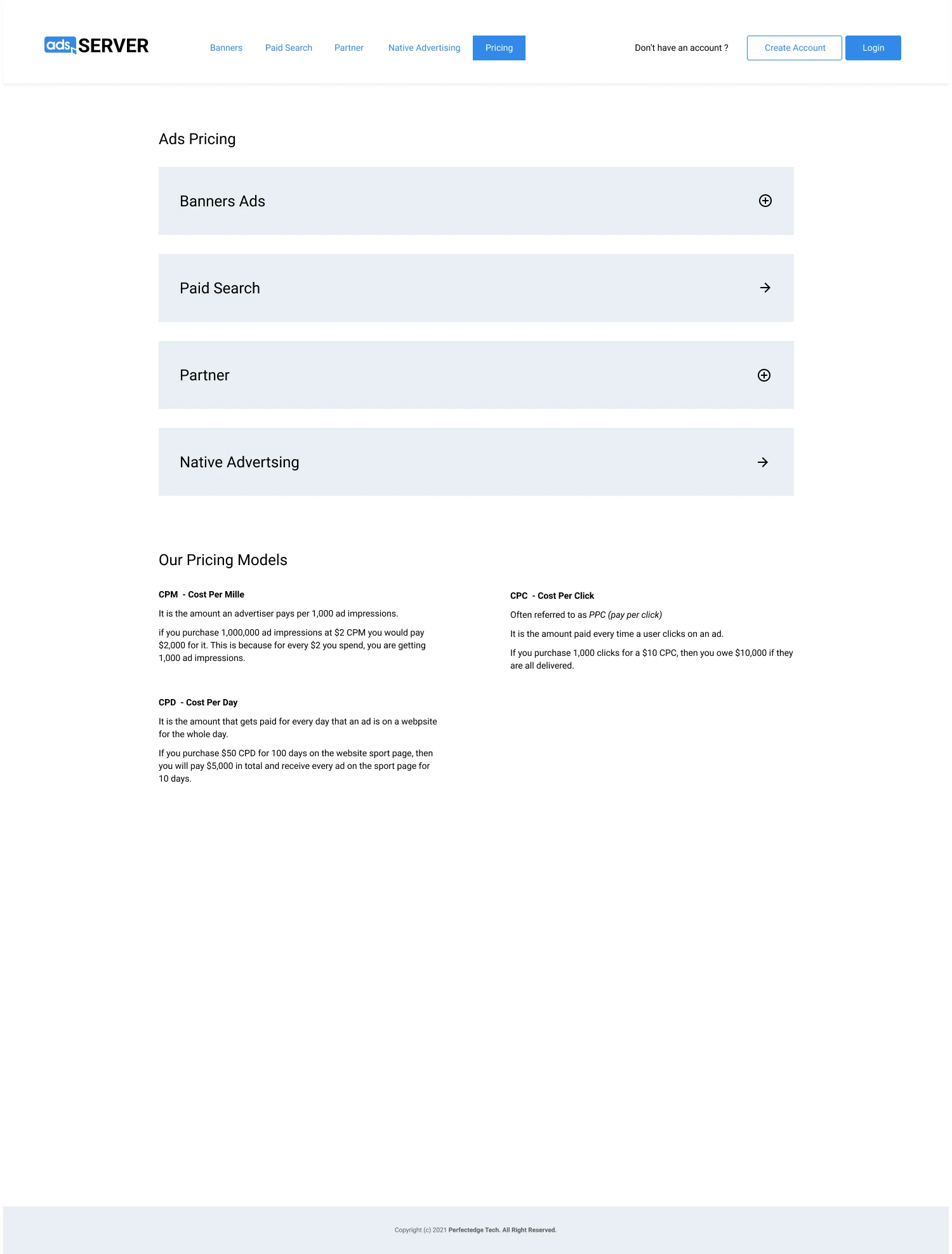
AdServer Public Page Experience
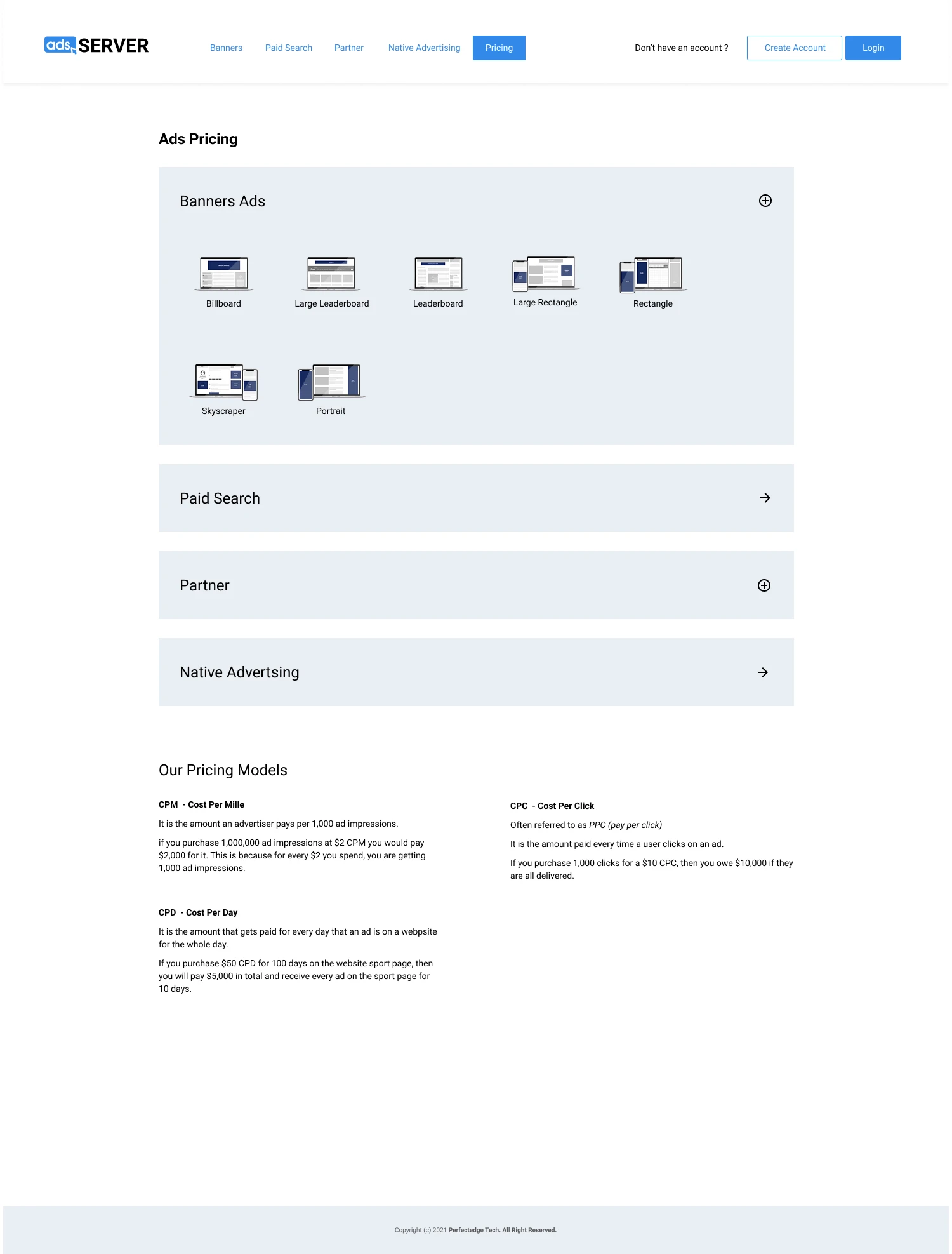
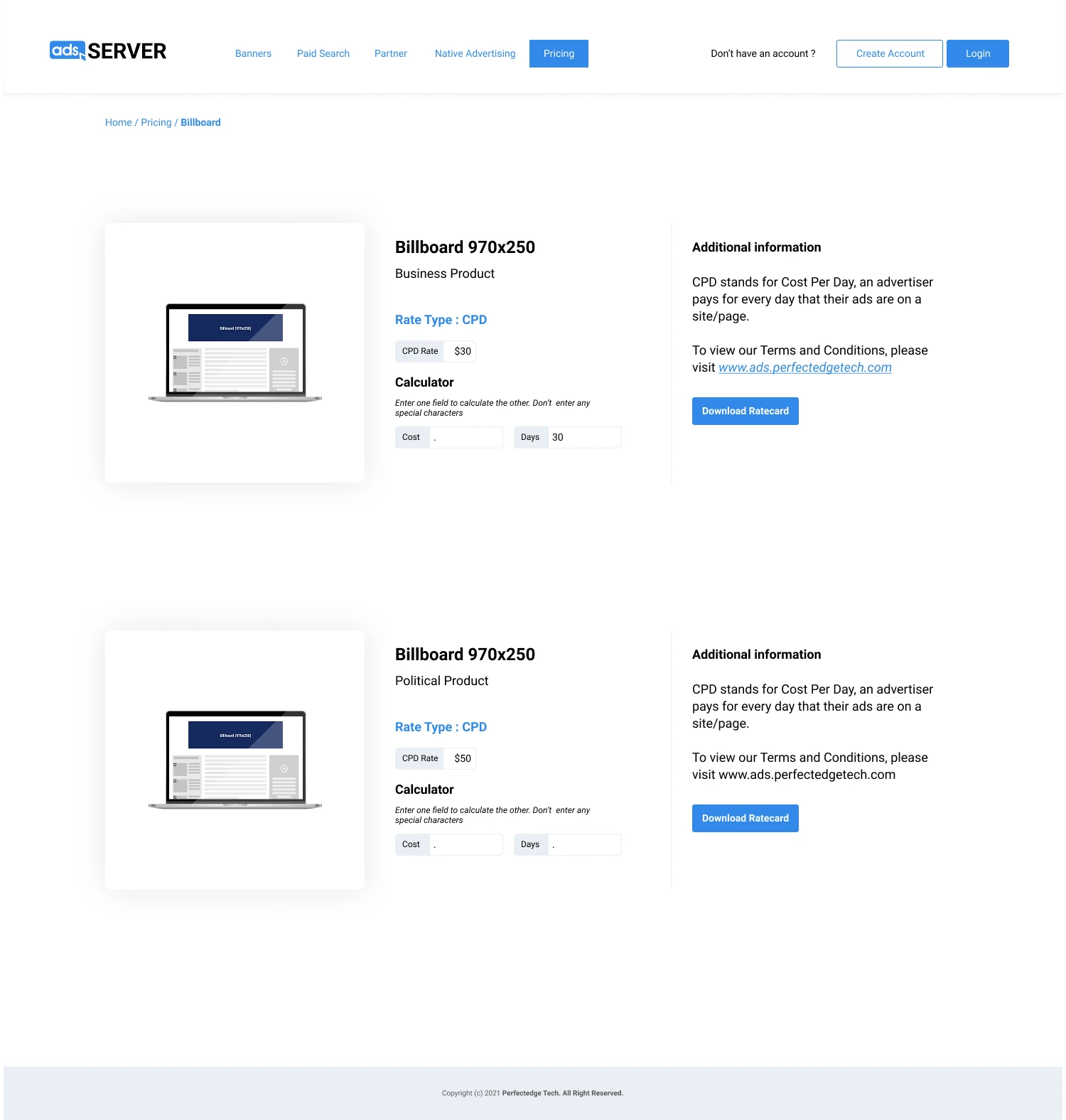
These screens show the AdServer landing experience, where advertisers can preview ad formats and pricing models before signing in, so they understand what they’re buying upfront. Users can explore campaign types and banner formats such as Leaderboard, Skyscraper, Billboard, Rectangle, and Large Leaderboard, and compare pricing models like Cost Per Day and performance-based options before logging in to launch a campaign.


Authenticated experience
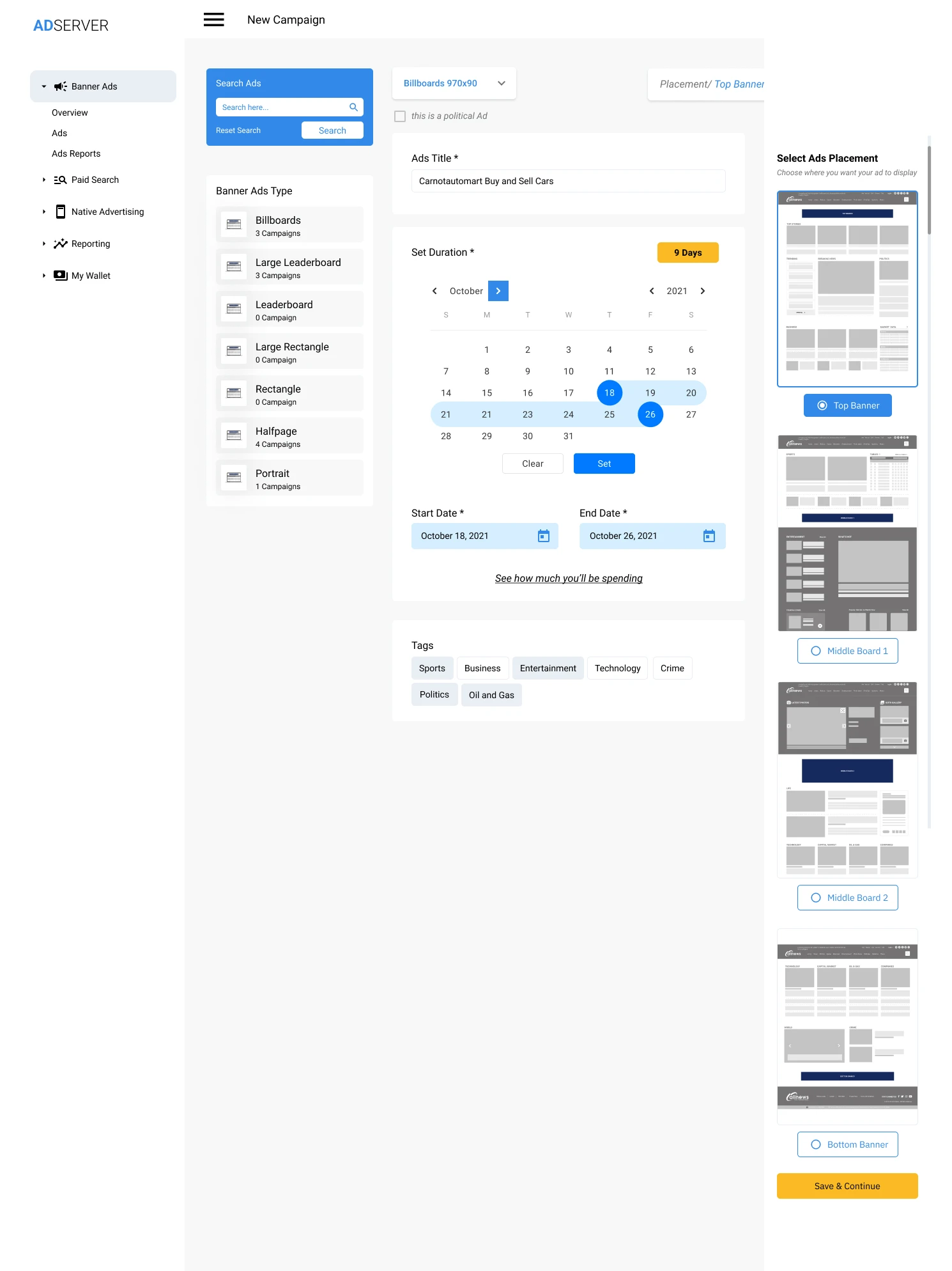
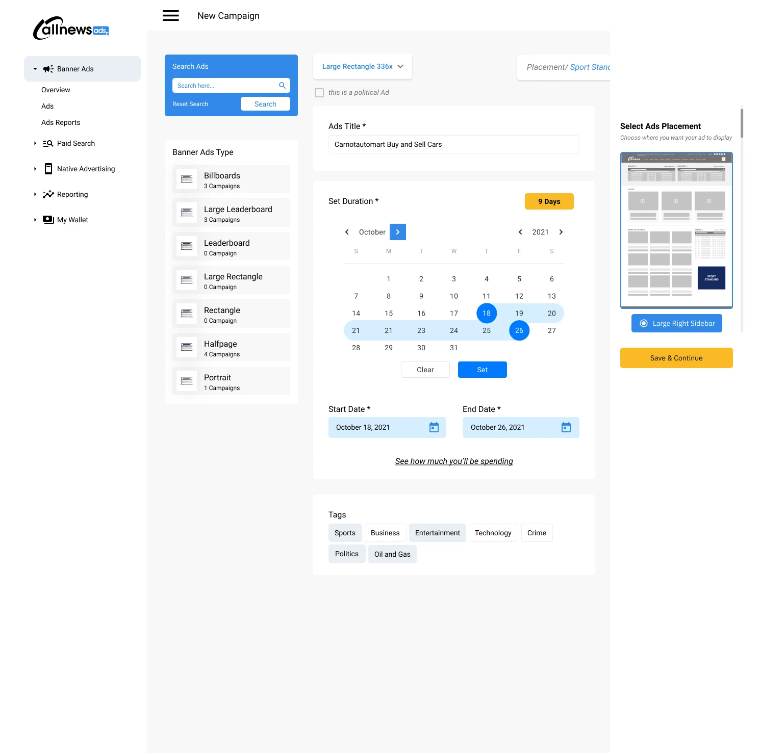
A Guided, Self-serve Dashboard Experience
End-to-end advertiser dashboard showing full control of campaign setup and management. Users can fund their wallet, configure campaign details including type, placement, location, and duration, and track status over time without needing to chase anyone for approval. This is where everything becomes “click, click, done.”
Project reflection
What Went Well
The Information Architecture made a complex problem feel simple. Advertising can get technical fast, but the structure helped keep it approachable.
I removed the awkward back-and-forth. Advertisers could move from “I want to advertise” to “My ad is live” without begging for attention.
The product created trust through visibility. The metrics dashboard made the experience feel legitimate. It’s the difference between “Your ad ran, trust us” and “Here are the impressions, clicks, and timeline. No stories.”


The real lesson
What Didn’t Go Well
This was the project where I learned that: confidence is not research.
Even with good design, if the real user priorities aren’t validated early enough, you risk building something people respect… but don’t really need.
We built a solid solution, but some users still preferred direct deals, negotiation, or informal ad placement. That behavior wasn’t fully accounted for early on.
Constraints and complexity
Challenges
Limited time for user validation
Because the project moved fast, research and testing were lighter than ideal. That increased risk.
Complexity creep
Advertising sounds simple until users ask:
- Can I target by location?
- Can I run A/B creatives?
- Can I pause and resume?
- Can I get refunds?
Each one sounds small, but they add up quickly.
Cross-team enablement
Pricing models
When we introduced CPD, CPC, and CPM, it became clear the dev team didn’t have enough context to calculate them correctly. I ran a quick working session to explain each model, define the formulas, and agree on how we’d handle edge cases like partial days and rounding. That alignment saved us from shipping “wrong math,” which is the fastest way to lose advertiser trust.
What I’d Do Next
Quick validation loops
If I were improving this today, I’d focus on quick validation loops. Not big, expensive research. Just fast feedback that keeps you from building in the dark.


Reflection
Lessons Learned
AdServer pushed me in a good way because it forced me to separate two things that designers sometimes mix up: “This makes sense to me” and “This is what users will actually adopt.”
On paper, the idea felt obvious. “Advertisers want to run ads without stress.” True. But building a product that feels easy is different from building a product that gets used. This project made that difference very real. Assumptions are expensive, so I now push for early feedback, even when it’s scrappy.
It also sharpened how I approach three things today:
Discovery isn’t optional: I learned that assumptions are expensive. Even when the idea feels common sense, users still have their own habits, fears, and decision-making process.
Validation beats confidence: I became more intentional about getting feedback early, even if it’s scrappy. A quick test with a few real advertisers is better than three months of polishing a flow nobody needs.
Scope needs a spine: Once you start adding “nice-to-have” features, the product can quickly turn into a confused toolbox. This project taught me to keep asking, “What’s the core job we’re solving?” and to design around that, not around excitement.
And it reinforced a rule I still use today: A clean UI can’t save the wrong product idea. Research can. If I’m proud of anything from AdServer, it’s not just the screens. It’s the lesson. Build what people will actually use, not what looks smart in a mockup.