
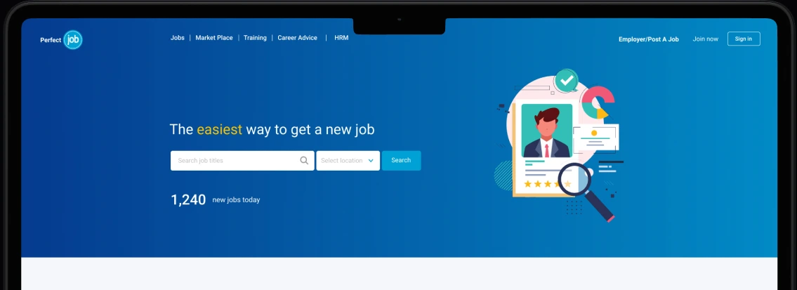
The starting point
Project Background
Perfectjob is a job advertising platform designed to connect employers, recruitment agencies, and job seekers. The problem was not that it didn’t work. It worked. It just didn’t feel modern, trustworthy, or competitive.
The platform looked dated and the experience had friction. Users could still find jobs, but the journey felt like work. That’s a dangerous thing for a job platform because job searching is already stressful. The product shouldn’t add more stress.
The business goal was clear. Perfectjob needed a redesign that would look credible next to major competitors, help job seekers find relevant roles faster, increase confidence and reduce drop-off, and create room for the product to grow into more than just a job board.
The objective
This wasn’t a “make it pretty” project. It was a “make it competitive” project.
Make the core experience work better
Job seekers needed faster job discovery, cleaner browsing, clearer next steps, and better confidence in listings.
Prepare the product for expansion without chaos
Introduce Marketplace, Training, Career Advice, and HRM tools without turning the product into a cluttered supermarket aisle.
Evidence before interface
How I Collected Data and Made Decisions
I didn’t start this project by drawing screens. I started by trying to earn the right to design. That meant getting enough evidence to answer one question early: What’s actually broken, and what’s just noise?
I spoke with real users and pulled in quick signals from surveys and existing feedback. Once the same issues appeared across different people, I grouped them into themes and checked those themes against the market. Every idea then passed a simple filter: Does it reduce friction? Does it build trust? Does it move the business needle? What is the effort to build it?
Finally, I validated quickly with clickable prototypes and task-based checks. The loop was evidence, decision, prototype, test.
Value proposition
Customer Value Proposition (Job Seekers)
Job hunting can feel like walking into a dark room and stepping on Lego. You don’t know what’s real, you don’t know what’s still open, and after you apply, it’s usually silence. This map captures the real pain behind that experience, plus what job seekers actually want instead. Not more jobs on a page. More clarity, trust, speed, and a simple way to track progress from applied to hired.






Platform value
Business Value Proposition (Platform)
On the business side, the goal isn’t just traffic. It’s a marketplace that runs on trust, repeat usage, and measurable outcomes. This map shows how the platform’s features create value by reducing scams, improving match quality, and making applications easier to manage. It connects product decisions—search, verification, dashboards, subscriptions, and analytics—to what keeps employers paying, job seekers returning, and the brand looking credible.



Services Gain Creators Pain Relievers Job listings + search Employer and company profiles Applicant management dashboard Employer subscriptions / premium plans Basic analytics (views, clicks, applications) Trust features (verified employers, report scam listings) Aptitude Test & Training Candidate profiles / Resume upload & Templates Profile strength meter + improvement tips Application tracking dashboard Quick Apply with saved profile/CV Similar jobs and “People also applied to” suggestions Fake jobs and scams Verified employer badges + fraud detection Interview prep resources Smart job recommendations (skills, experience, location) Still hiring / last updated status labels Duplicate listing cleanup and quality control Scam reporting + moderation workflow Verification flow for postings and employers Filters that actually work (salary range, remote, level, category) Simplified apply flow (few steps, auto-fill, CV parsing) Clear rejection / feedback messaging templates


Research synthesis
Alignment Gap
Because Perfectjob serves two primary user groups, we created an alignment map to balance what job seekers need, what employers and HR teams need, and what the business needs to grow. This helped us spot where goals overlap—trust, relevance, and simplicity—and where they clash—volume versus quality, speed versus structure.
We used these insights to guide decisions around navigation, job discovery patterns, and how we structured job information to improve both application success and employer outcomes.

The strategy
A structured approach—not just design screens.
This is where I led the team through a five-step product strategy that kept the core job-seeking journey clear while preparing the platform to grow.
- 01
Information architecture first. Before UI.
We redesigned the IA so the site felt like a job-search tool first and a career-support ecosystem second. Job discovery stayed the hero experience while training and advice supported the journey.
- 02
Build a job discovery engine, not a homepage poster.
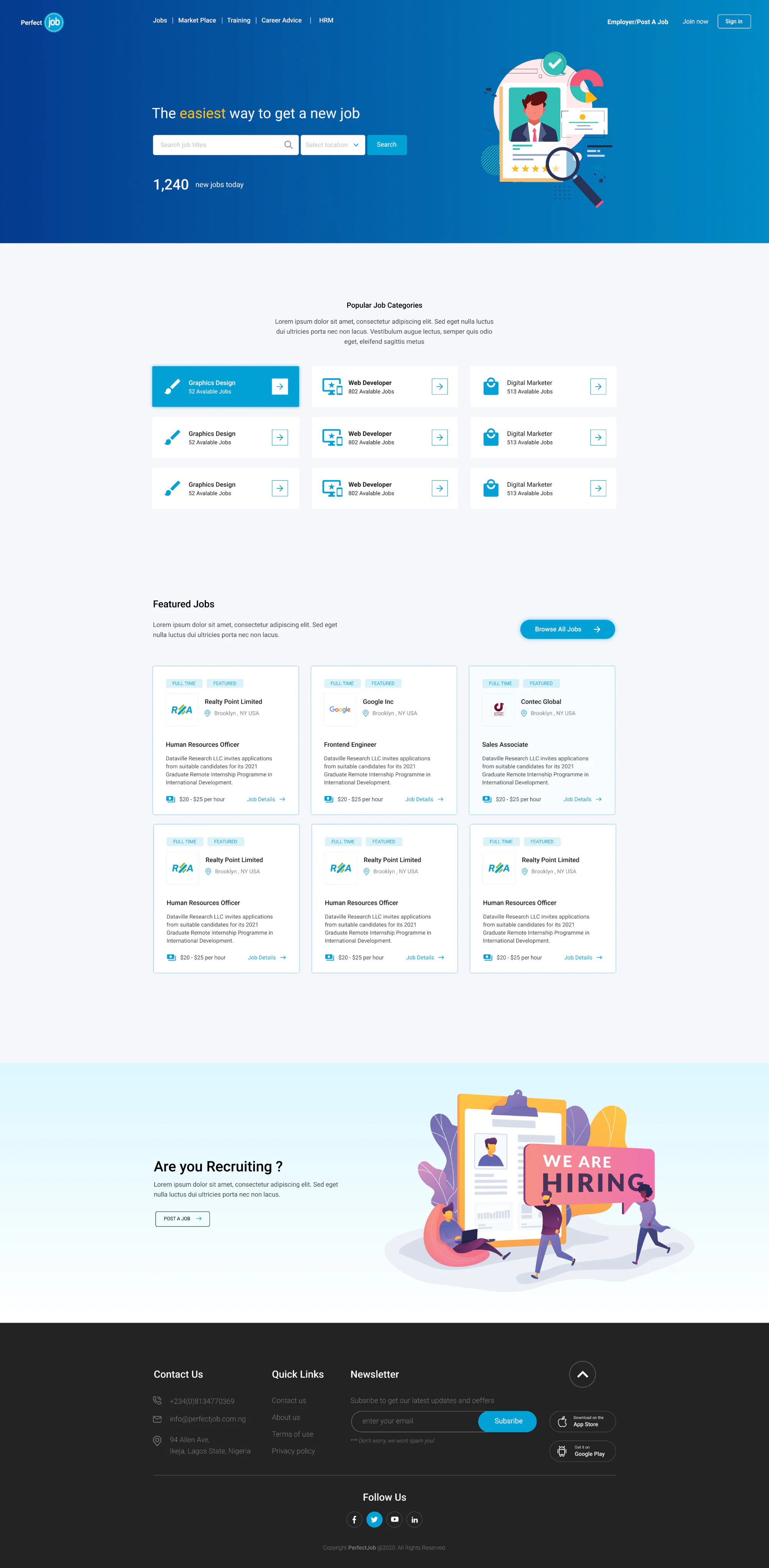
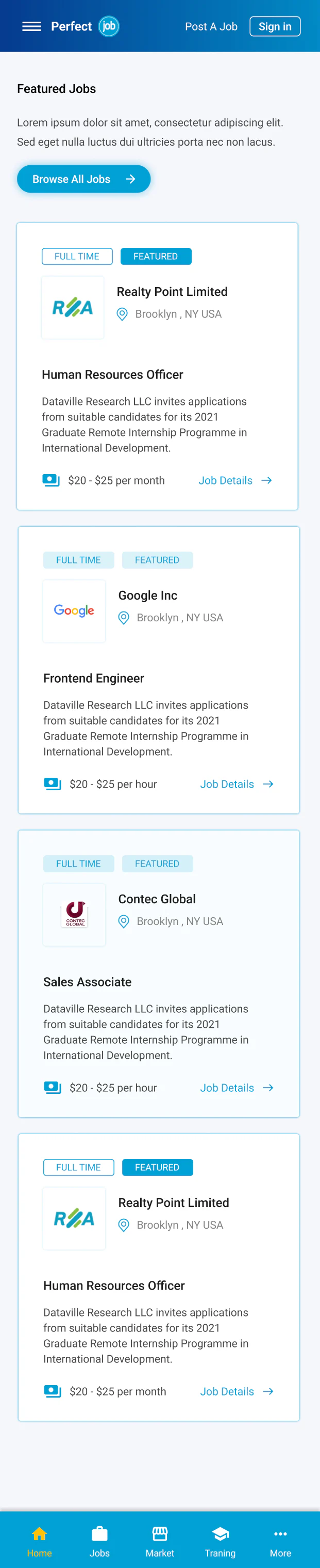
The homepage supports immediate browsing and intentional search with job categories, featured roles, clearer calls to action, and a stronger layout hierarchy.
- 03
Make trust a design feature.
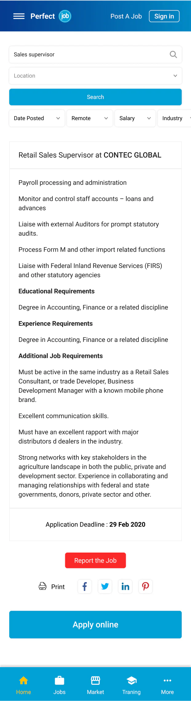
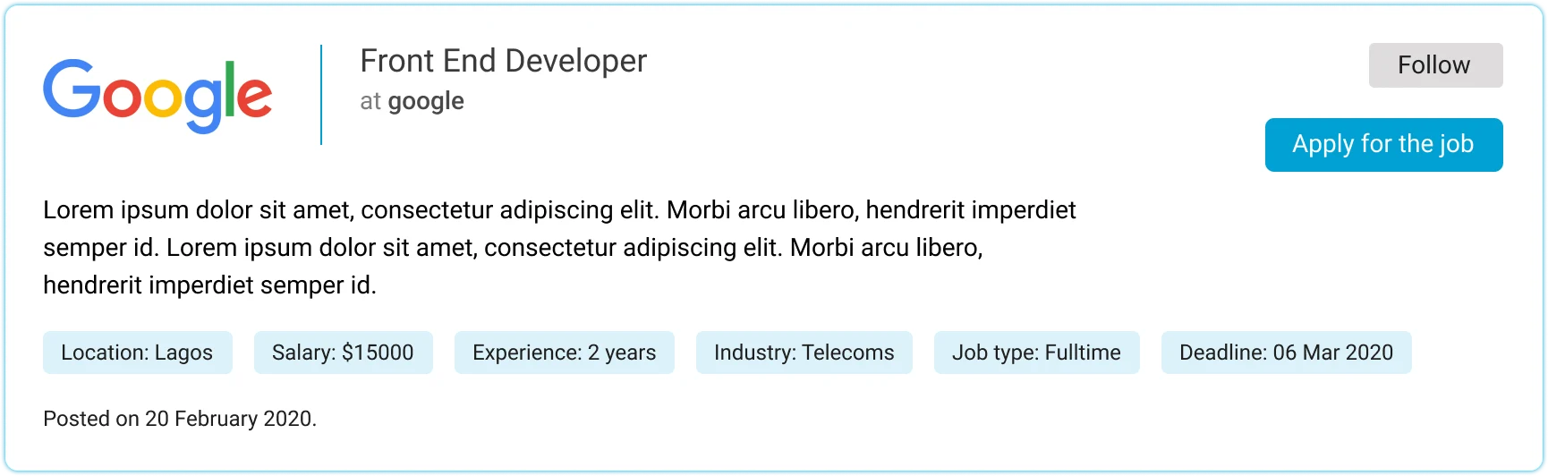
Cleaner job details, consistent layouts, clearer grouping, better spacing, and a professional hierarchy made credibility part of the core experience.
- 04
Prototype to align faster.
Clickable prototypes validated flow decisions, reduced stakeholder misunderstandings, accelerated feedback, and helped developers understand intent without extra meetings.
- 05
Design for scale.
Reusable patterns gave Marketplace, Training, Career Advice, and HRM room to expand without rewriting the whole product every time.
Responsive product experience
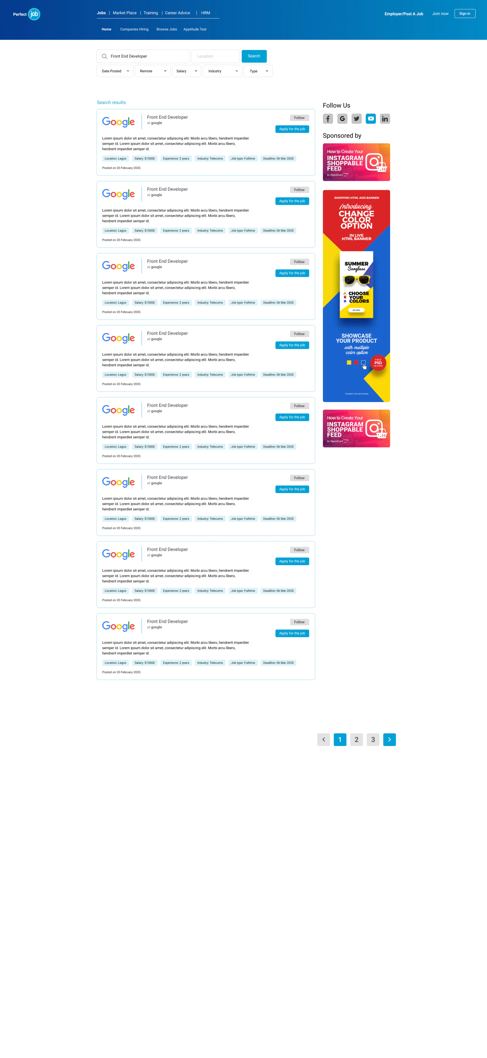
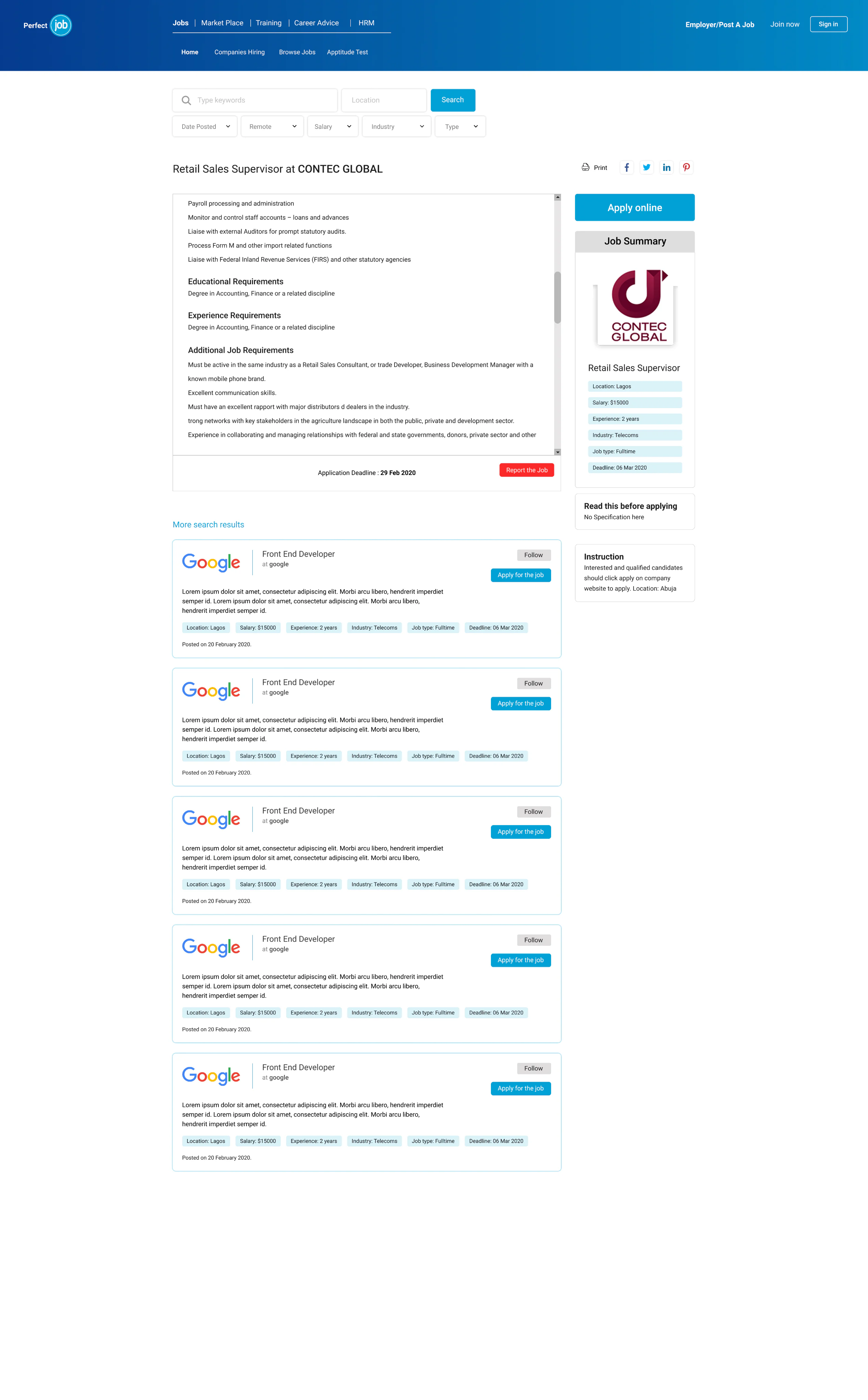
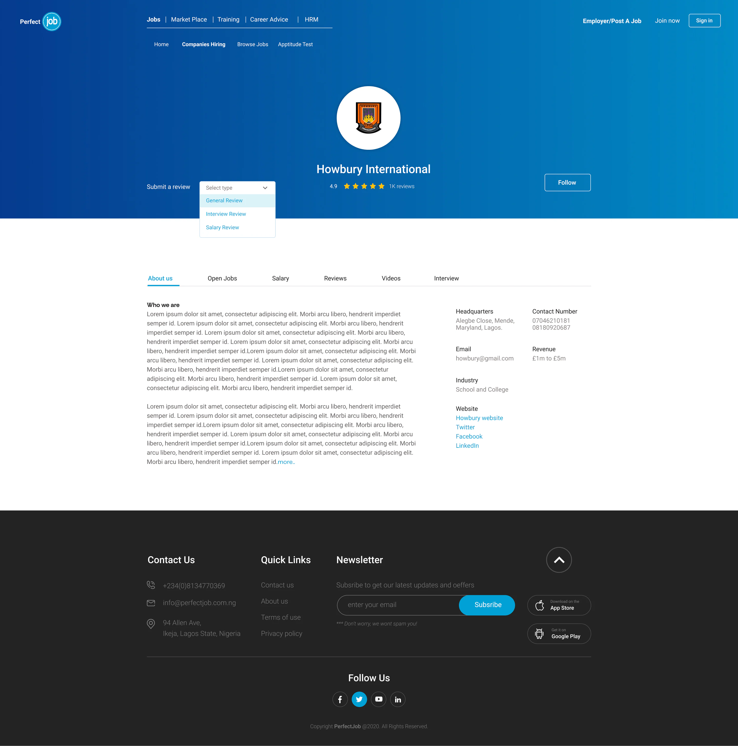
A job discovery engine, not a homepage poster
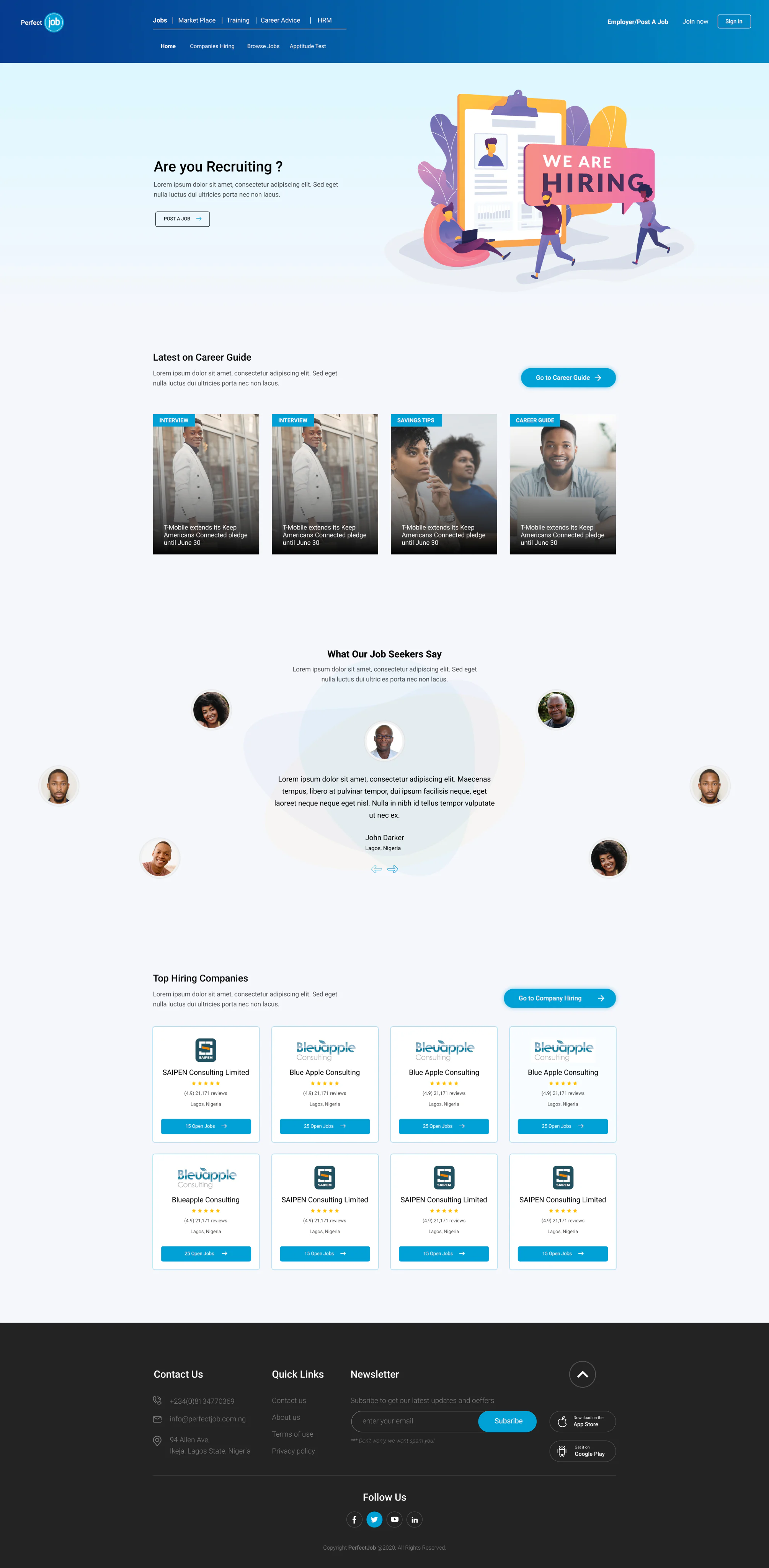
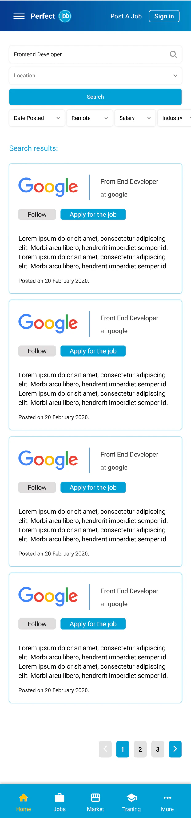
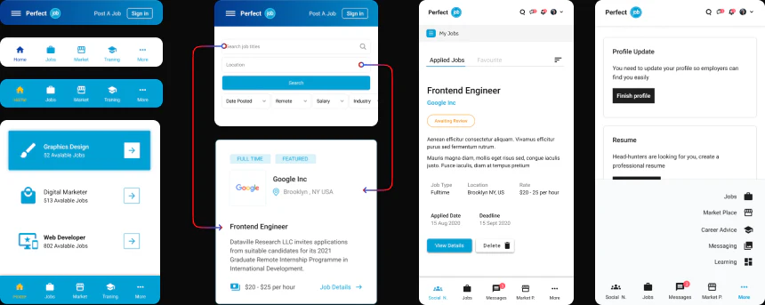
The redesigned experience supports immediate browsing and intentional search, with clearer categories, featured roles, stronger hierarchy, and more credible job details.


Mobile experience
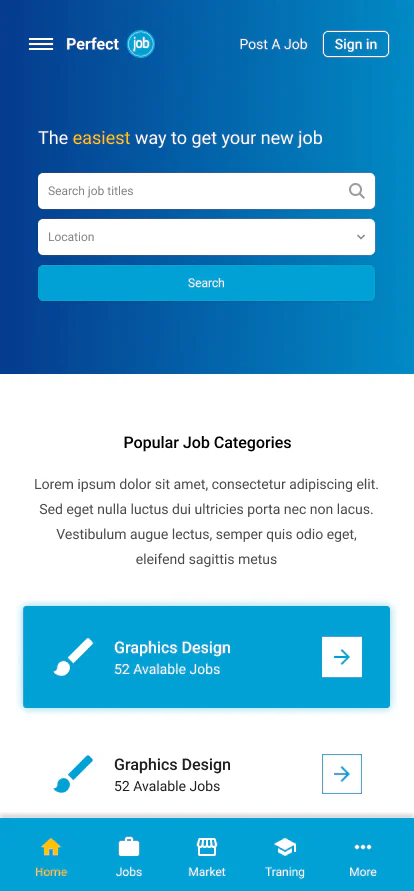
Job discovery wherever the search happens





What changed
Keeping the core journey focused
Discovery first, not feature marketing
We kept the homepage focused on finding jobs fast. Expansion features support the journey; they don’t compete with it.
↗Reduce cognitive load with clearer paths
Browsing and searching were treated as two different user modes. We designed for both so users don’t feel lost.
↗Trust signals baked into the core flow
We improved job detail clarity and visual credibility because job seekers won’t apply if they don’t believe the listing.
↗The application journey
From registration to getting hired
- 01
Registration
You need to sign up first.
- 02
Select Work Area
Target your preferred jobs.
- 03
Apply for Job
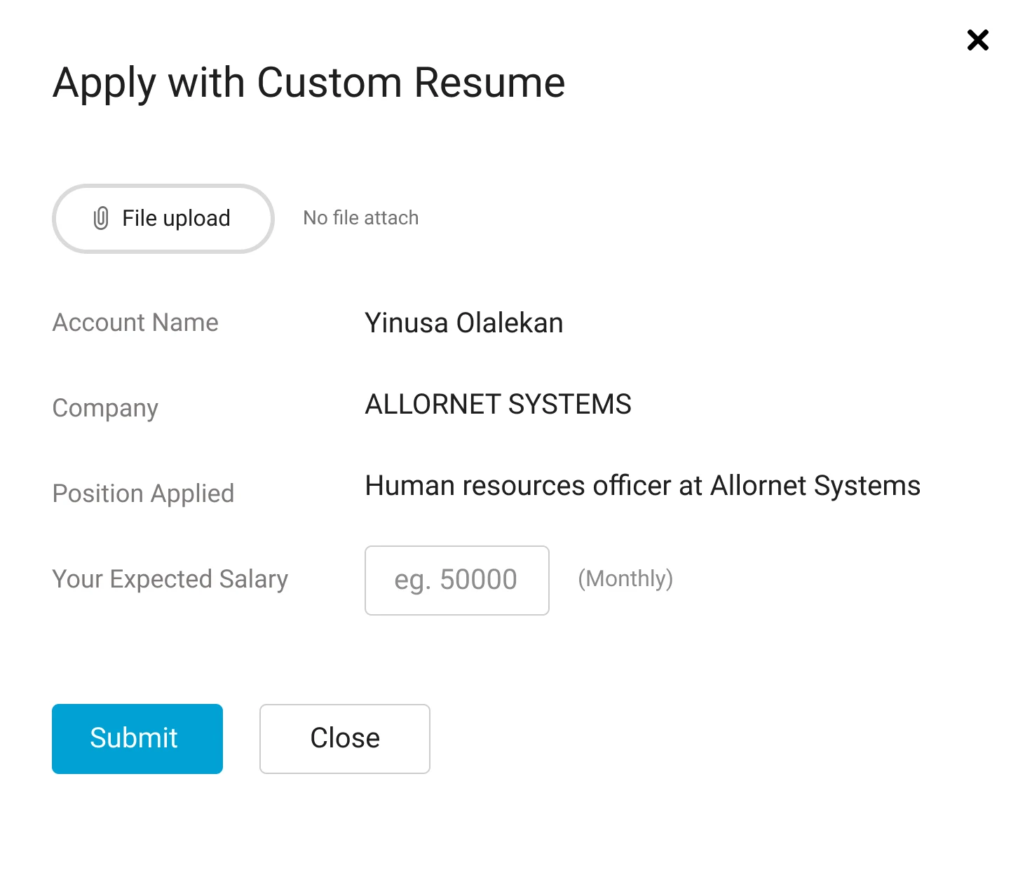
Upload your résumé and find jobs.
- 04
Get Hired!
Yes—after a successful interview.
Flow simplification
Removing friction without removing confidence
Before (high friction)
Home → Search → Random results → Open job → Long apply → No status feedback
Pain points we designed against: weak filtering, long forms, low trust, and no visibility after applying.
After (simplified and trust-led)
Home → Category browse or Search → Filters that work → Job detail with trust signals → Quick Apply → Application tracking dashboard
Challenges
Scope vs focus
When products want to become everything, the risk is losing the core experience.
We handled this by making job discovery the primary path, structuring add-on features as supportive paths, and keeping the homepage clean and goal-driven.
Balancing speed with quality
Modernization projects always have pressure. The solution was quick wireframes early, prototypes for feedback, and design rules that prevented inconsistency.
Product decisions
How we made scope decisions (so the product didn’t become everything)
Once we opened the door to Training, Marketplace, and HRM, scope could easily swallow the core job-search experience. Every proposed feature had to pass a quick filter.
- Does it help users find and apply faster?
- Does it increase trust in listings and employers?
- Does it improve employer outcomes enough to justify the build?
- If it didn’t pass at least two, it stayed in the backlog with a clear reason.
How we measured success
Speed, confidence, and completion
We tracked the signals that map directly to the job seeker journey—speed, confidence, and completion.
Beyond the job post
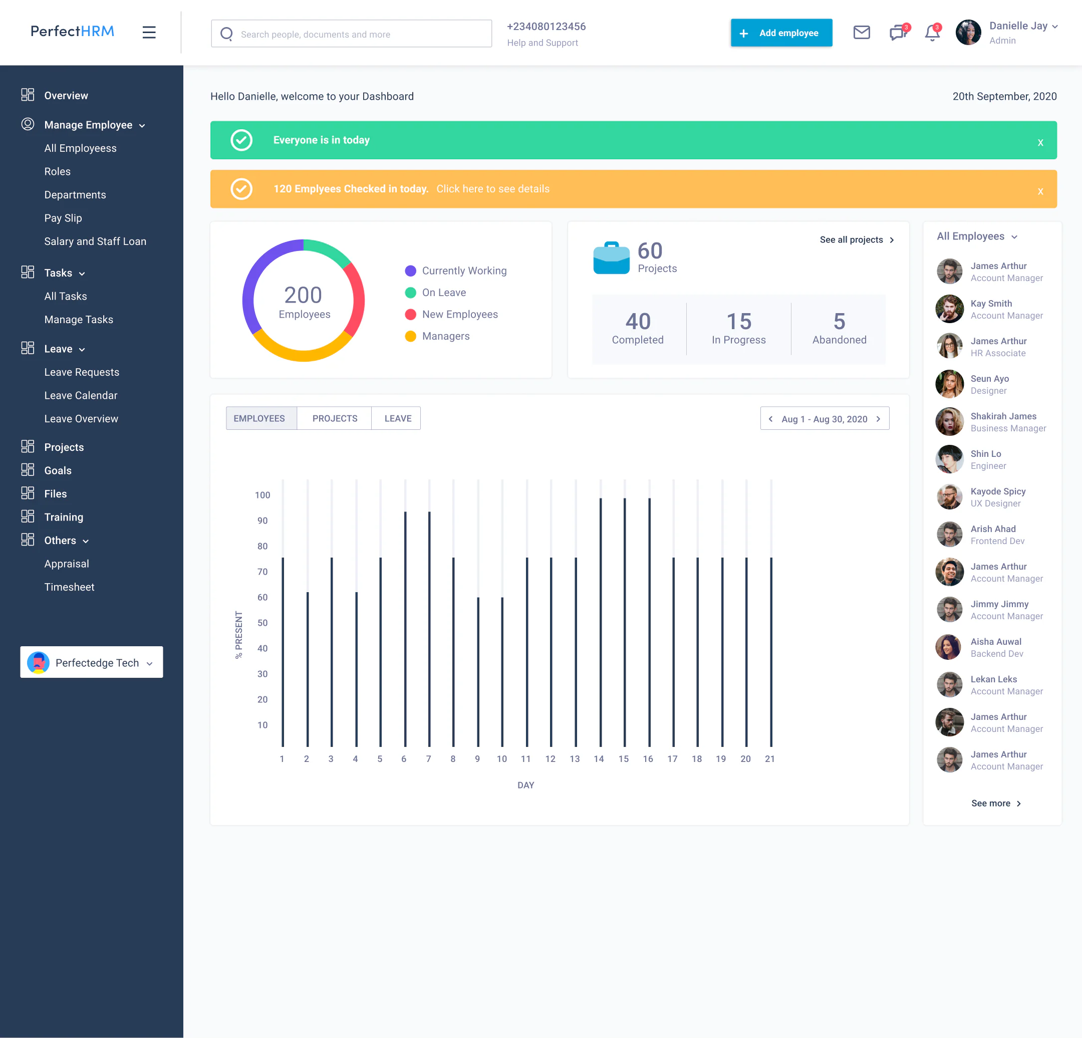
HRM Dashboard (Beyond Recruiting)
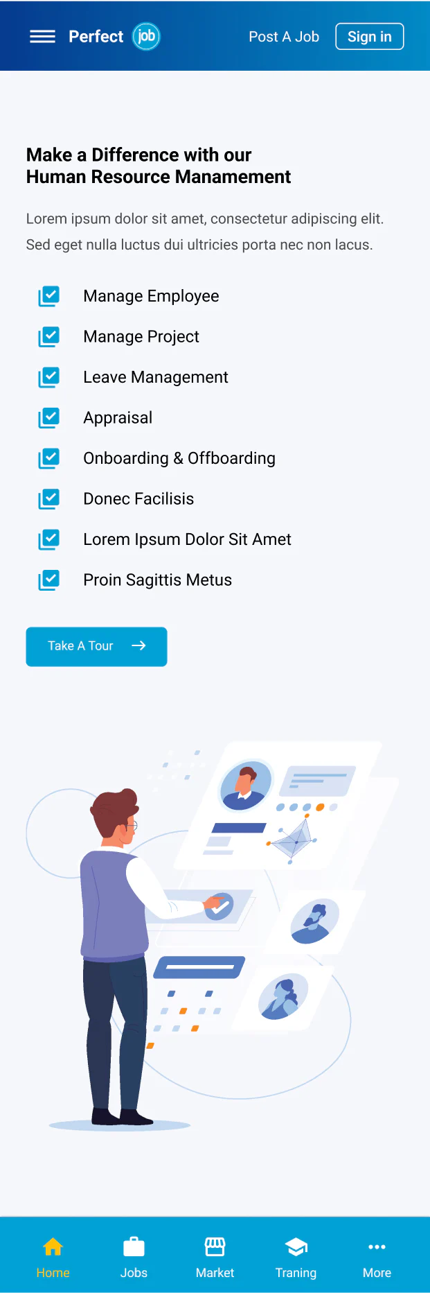
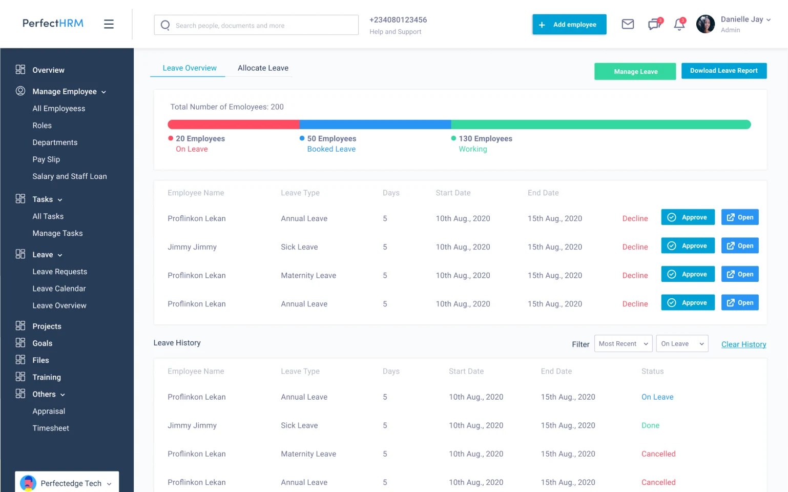
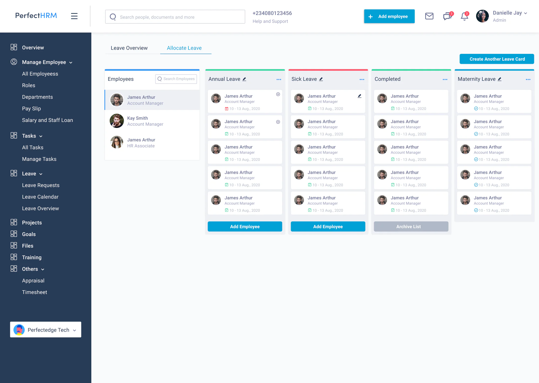
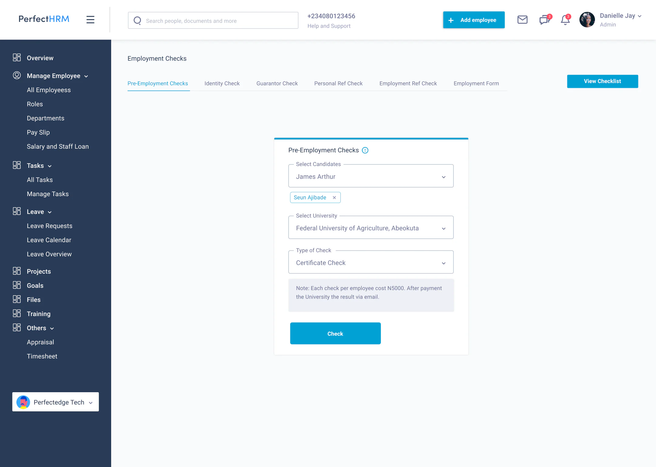
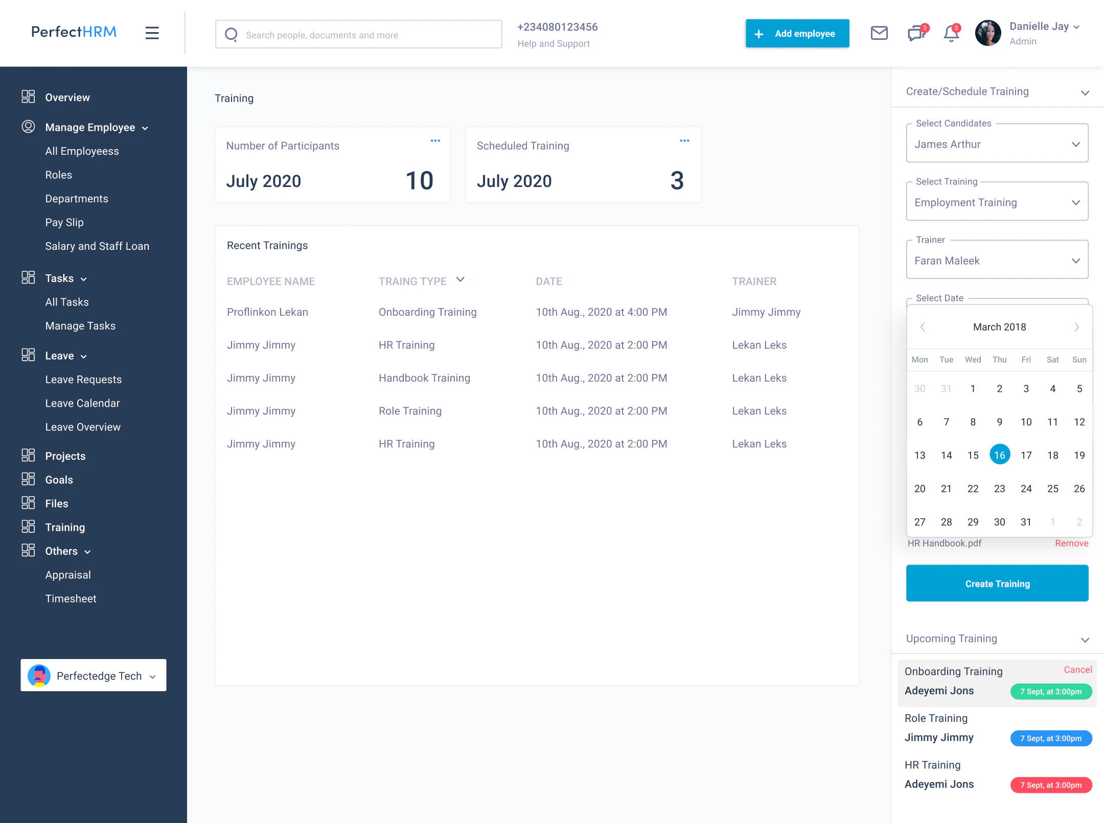
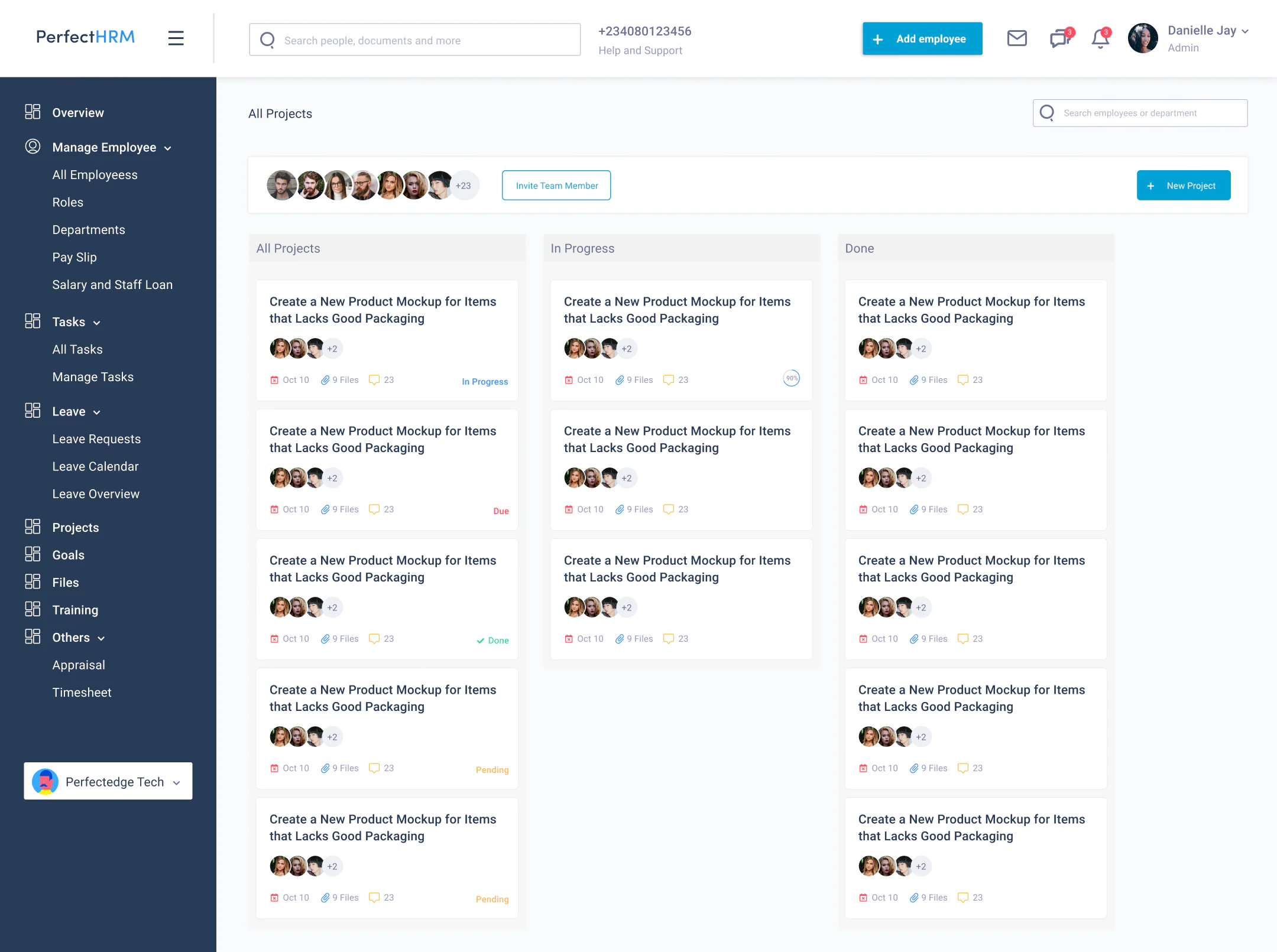
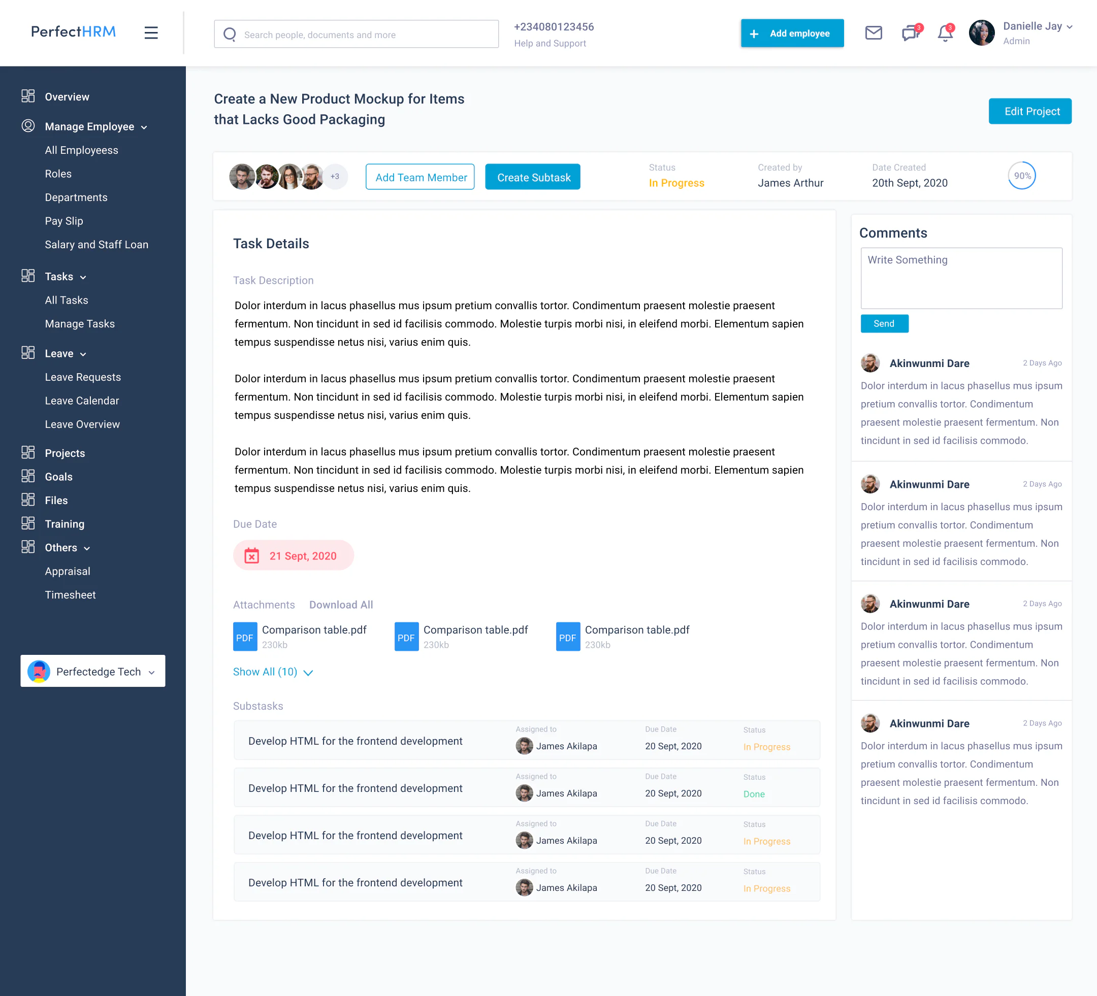
After the job post comes the hard part: managing people. This dashboard covers hiring, onboarding, employee records, projects, tasks, and leave management, so managers can run their team without chasing updates across WhatsApp, spreadsheets, and random tools.


Lessons learned & key takeaways
Clarity wins. Every time.
Job seekers want speed and clarity. Employers want qualified applicants and control. The business wants growth and retention. Good product design means balancing the triangle without pretending everyone wants the same thing.
Start with the job-to-be-done, not the features. Clarify the one thing users came to do, then design everything else around that.
If users don’t trust the platform, they won’t finish the flow. Build credibility into the interface, not just the brand message.
Design for scalability early. A solid information architecture and reusable UI patterns let the product grow without getting ugly.
A clean UI can’t save a confused product. Clarity wins. Every time.